1 Planet is intended to educate the general public about their carbon footprint impact and provide a medium to help offset it. We have observed that 1Planet site is not meeting their goals in educating the public and inciting action for carbon reduction which is causing confusion and an overall decrease in user registration.
We aim to improve the platforms design so that their users are better educated on the topic of carbon emissions as well as feel empowered to make a change through the platform, thus increasing the overall frequency of user registration as well as re-engagement.
CLIMATE FUTURES
Time: 2 weeks
Role: UX+UI
Team: 2 members
UXUI PROCESS
Our framework provides certainty that we are developing a product that is in full accordance with the most effective UX practices that enhance the usability, accessibility and pleasure when using the product, and thus increasing user engagement.

HEURISTICS
The criteria used to support and analyze research is bucketed into three main categories, which are Usability, Navigation and Education.
AUDIT
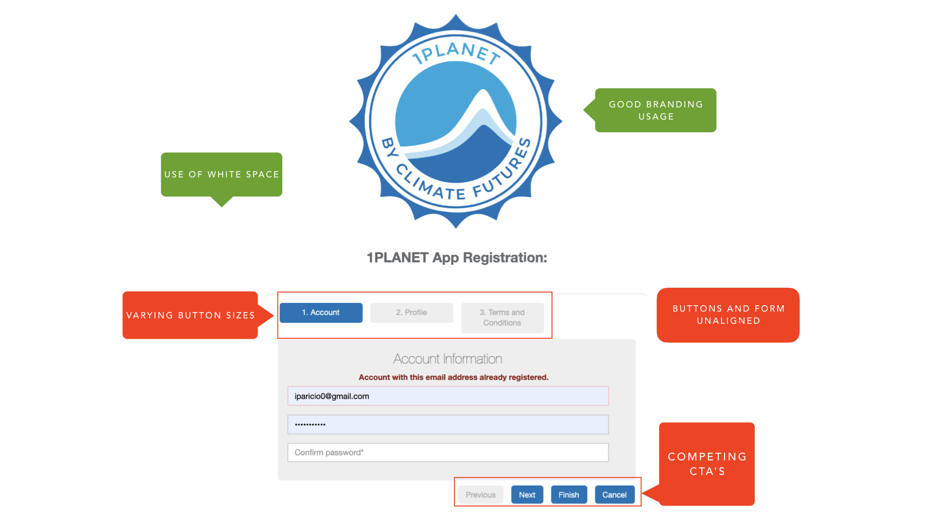


COMPETITIVE PRACTICES


1:1 USER INTERVIEWS
We tested the 1Planet landing page several times with random users through guerrilla testing 1:1 interviews.
Users mentioned wanting more information before registration.
Users declined calculating their footprint and registering before learning more about the platform and past projects.
Users asked for further education on different methods to approach offsetting their carbon footprint.
Users would like to see the status of a project as well as passed and future climate endeavors they have engaged with.
SURVEY
While analyzing our survey results, we were able to discover key information that helped us define user needs and expectations, and gave us a clear understanding about our stereotype personas which in turn will guide us towards an early design stage.

PERSONAS
Personas are a representation of the real target audience data, collected in a previous research such as 1:1 user interview, survey and social listening.


USER JOURNEY
Unravel what new opportunities we have to understand the users’ feelings and implement a solution to satisfy their needs in the most empathetic manner possible.

User journey was implemented to find the main key points to address in our design as well as explore oblique strategies to better engage the user
From all the opportunities that we gathered on our journey, and with a clear understanding of the users feelings. We translated them into possible features for the MVP.
PERSONAS
Personas are a representation of the real target audience data, gathered in a previous research such as 1:1 user interview, survey and social listening.
USER JOURNEY + FEATURE IDEATION
Our user journey workshop is where we list the actions that users will take from the moment they first interact with our product until they customize, purchase and track their sofa. We understand their feelings and identify friction points, that will later translate into features.


From what we observed during the user journey we then translated into possible features for the MVP.
FEATURE PRIORITIZATION + MVP
Taking all of the features from our ideation sessions, we conducted an MVP and we formulated the key performance indicators. With the collaboration from Web Developers we were able to provide levels of effort for each feature and map them out on a value to effort grid.
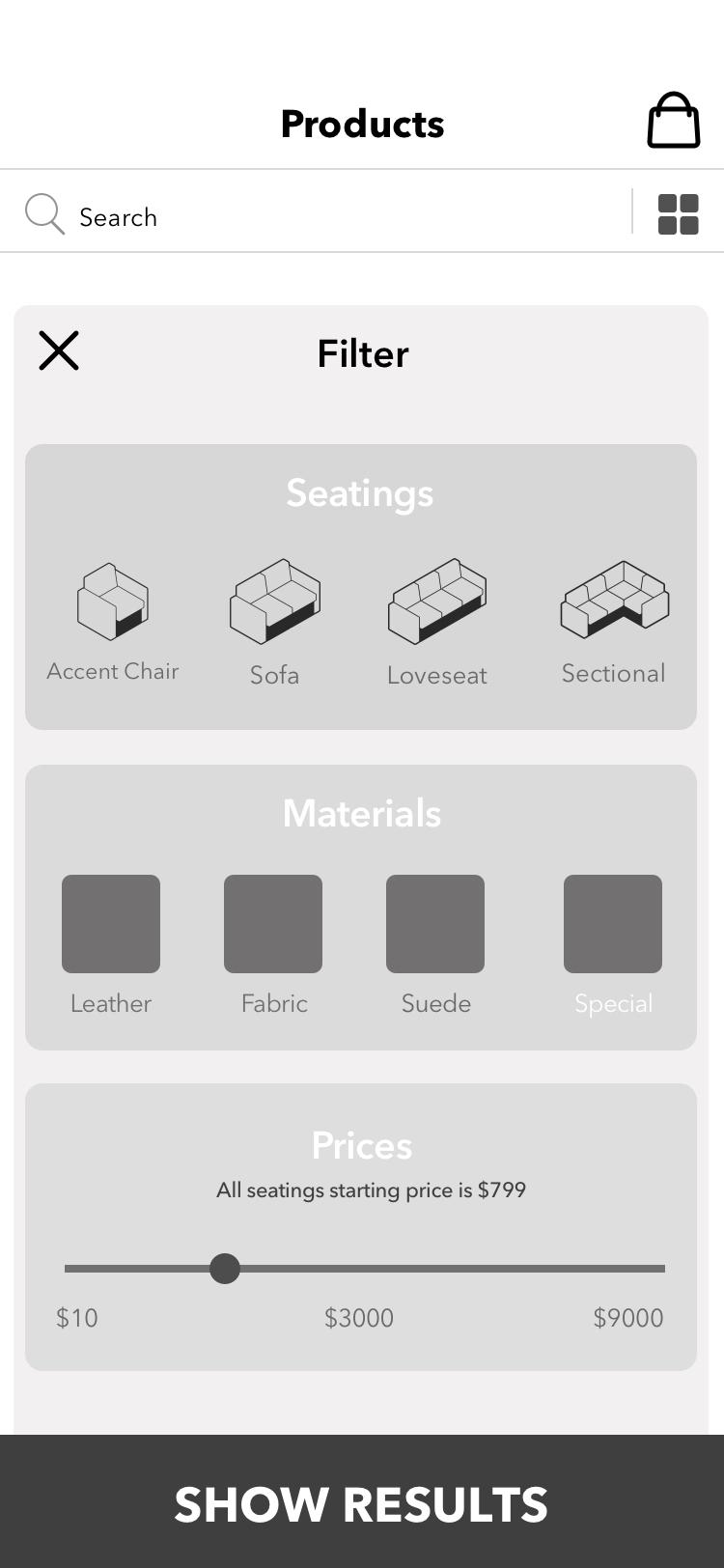
To define the priority level of our features and know what to work on first, we used the MoSCoW method: Must haves, Should haves, Could haves, and Won’t haves.


We worked with developers to formulate the key performance indicators as the success metric for the product results, and created the minimal viable product based off the effort-to-value mapping of the feature list. From there we moved to defining our product strategy for design.
UX STRATEGY

INFORMATION ARCHITECTURE
The sitemap help us clarify what our app goals are before we start designing or creating content. By deciding exactly what we want from our app and then mapping it out, we can ensure that every part of our app is reinforcing our strategy goals.

CREATE
With a clear strategy and a solid sitemap we started the Create Phase by designing wireframes. We spend long time creating on them because we really want to stay true to user-centered design. We created over 200 wireframes on sketch-app.
SKETCHES

WIRES

FLOWS
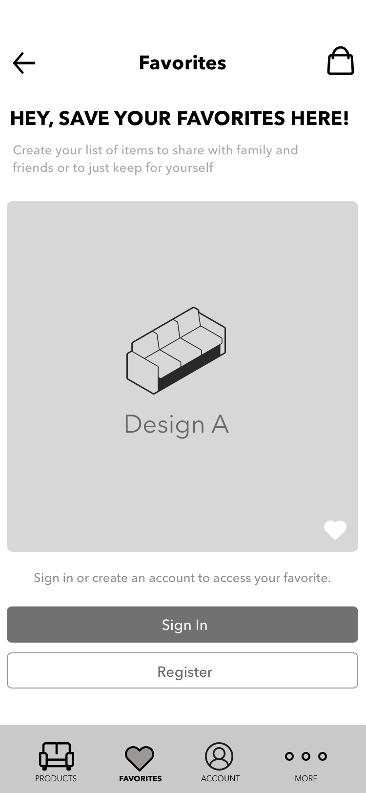
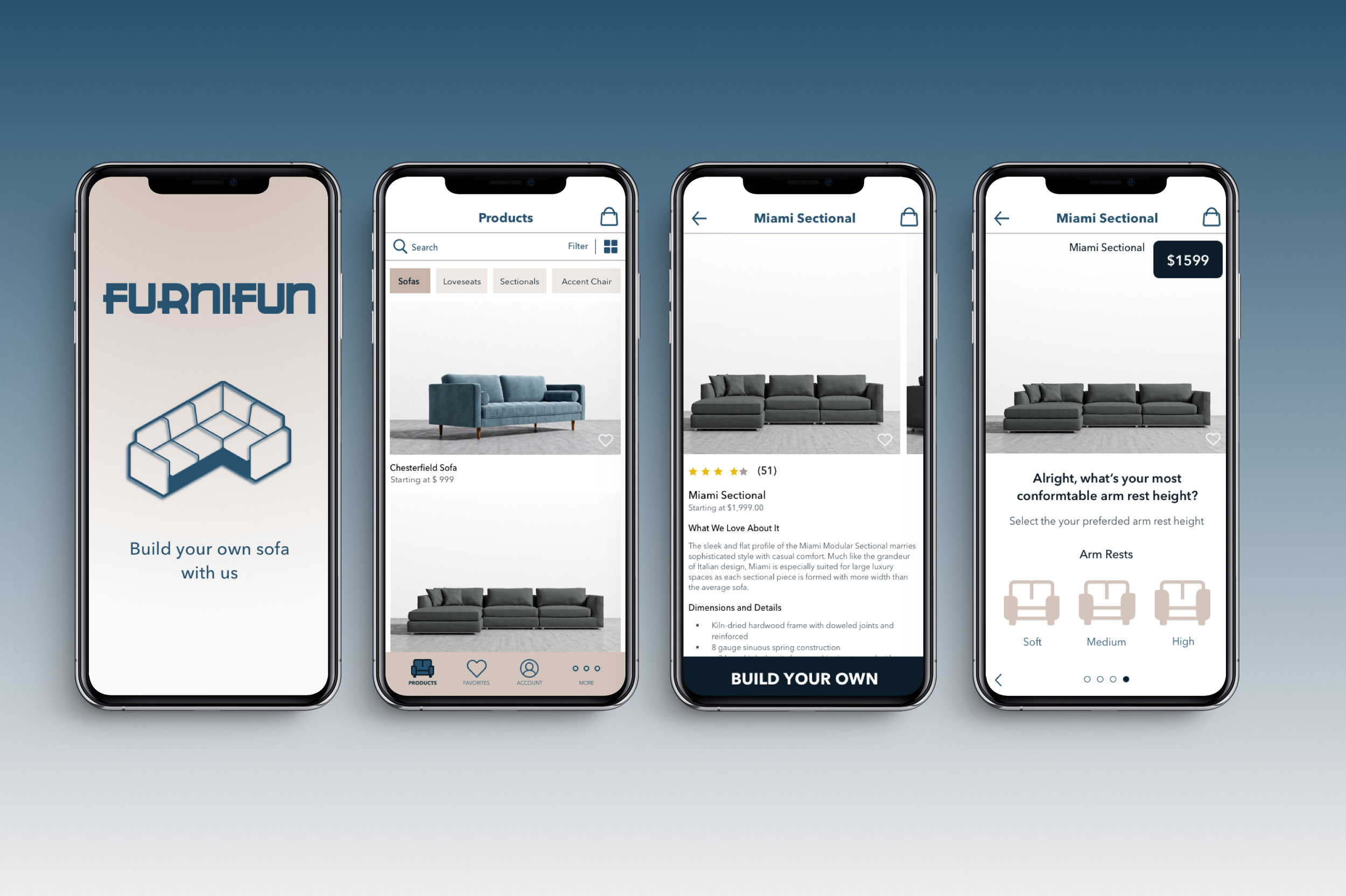
Find it Flow
Assist user on finding the right sofa


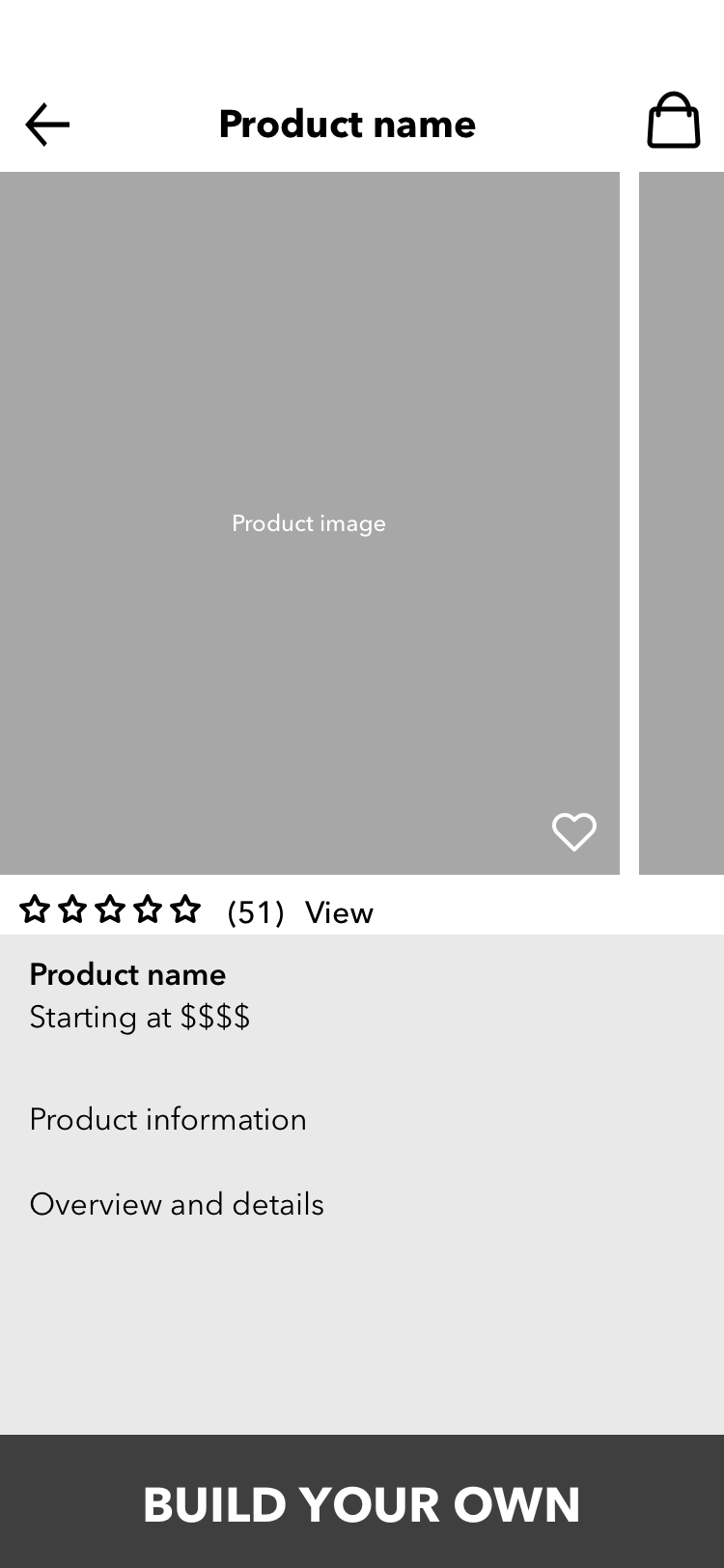
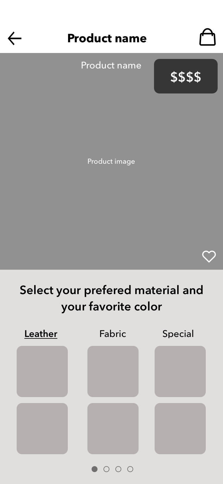
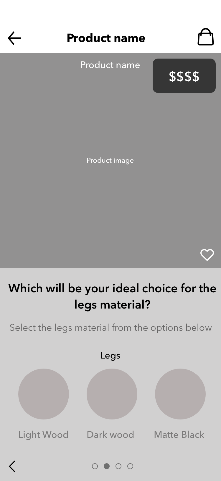
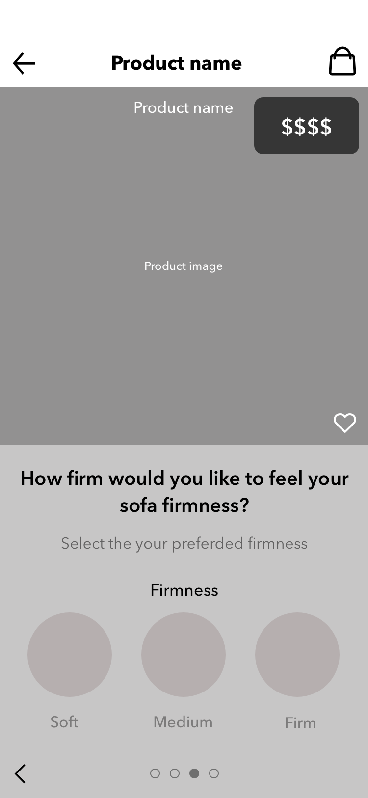
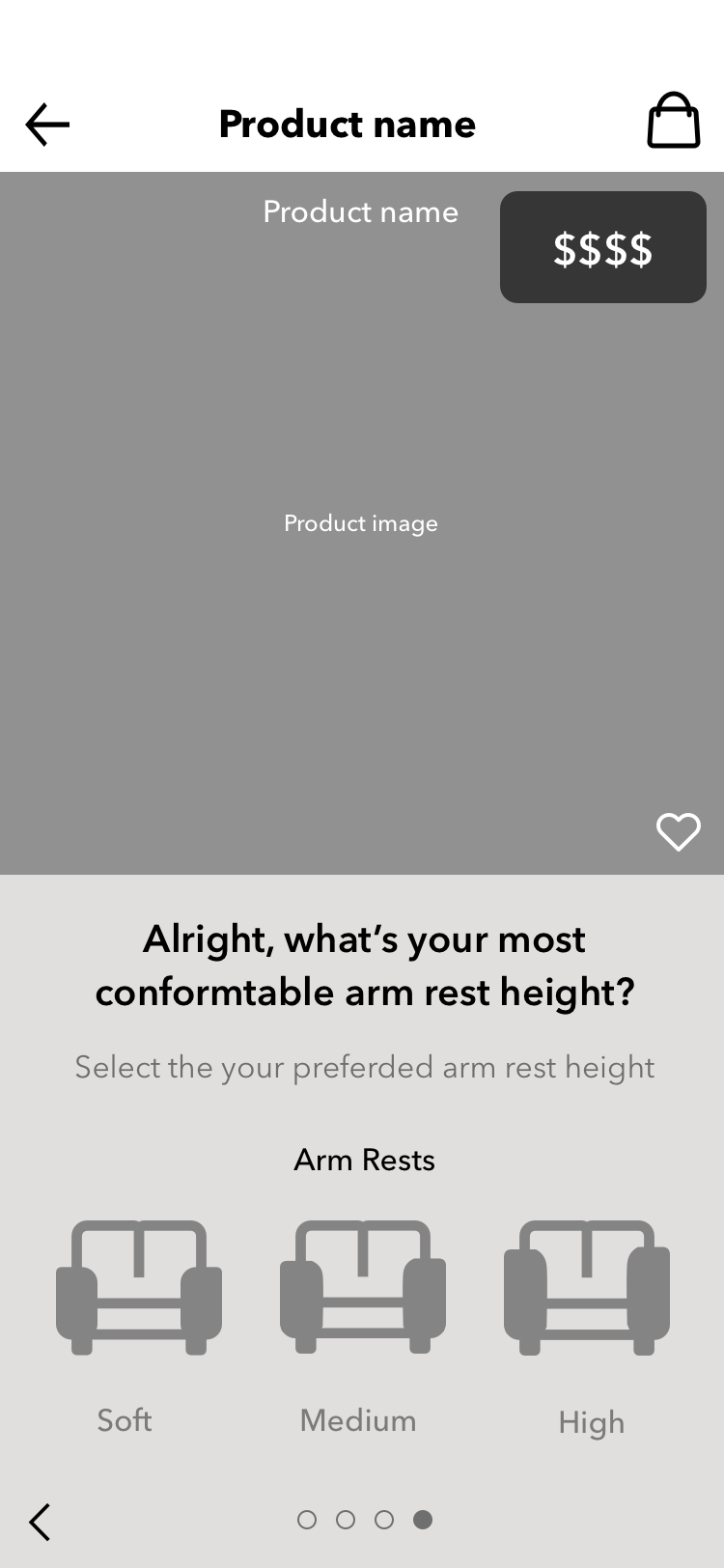
Customize it Flow
Build your own sofa from Product Detail page
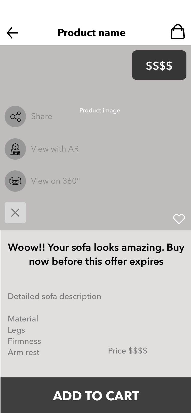
Try it Flow
Experience the product thru Augmented Reality and 360-degree view

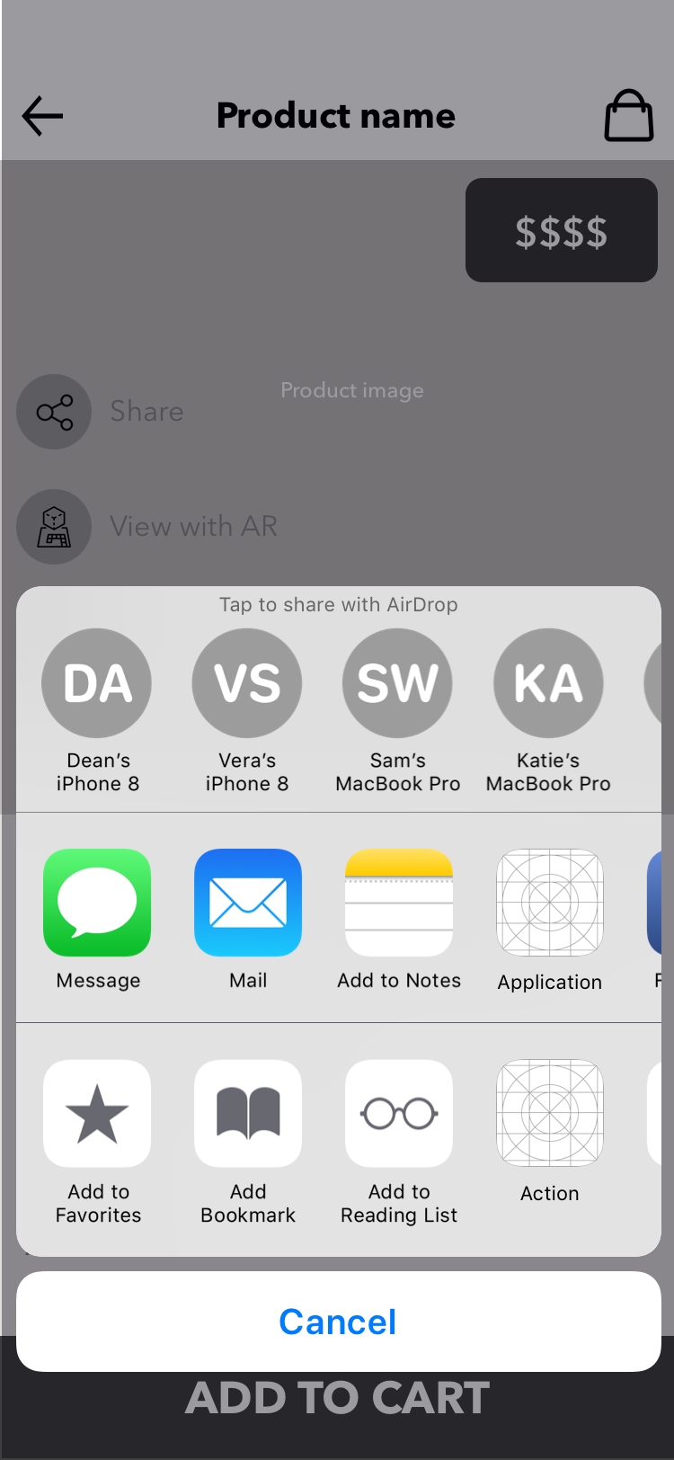
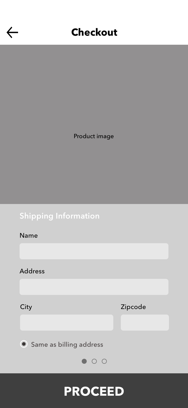
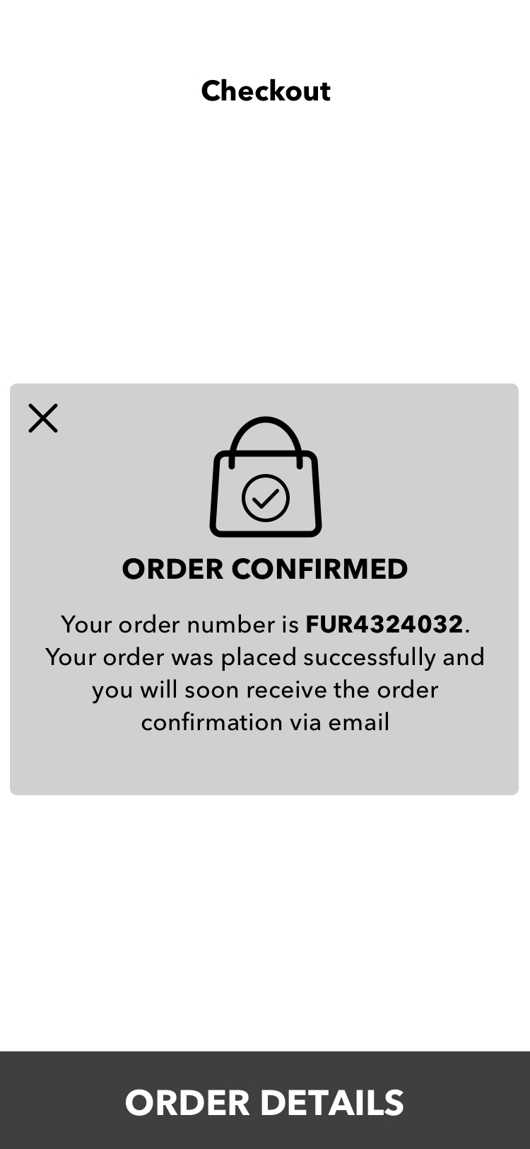
Buy it Flow
Easy transaction and path of completion
Share it Flow
Enabling users to share their sofa design

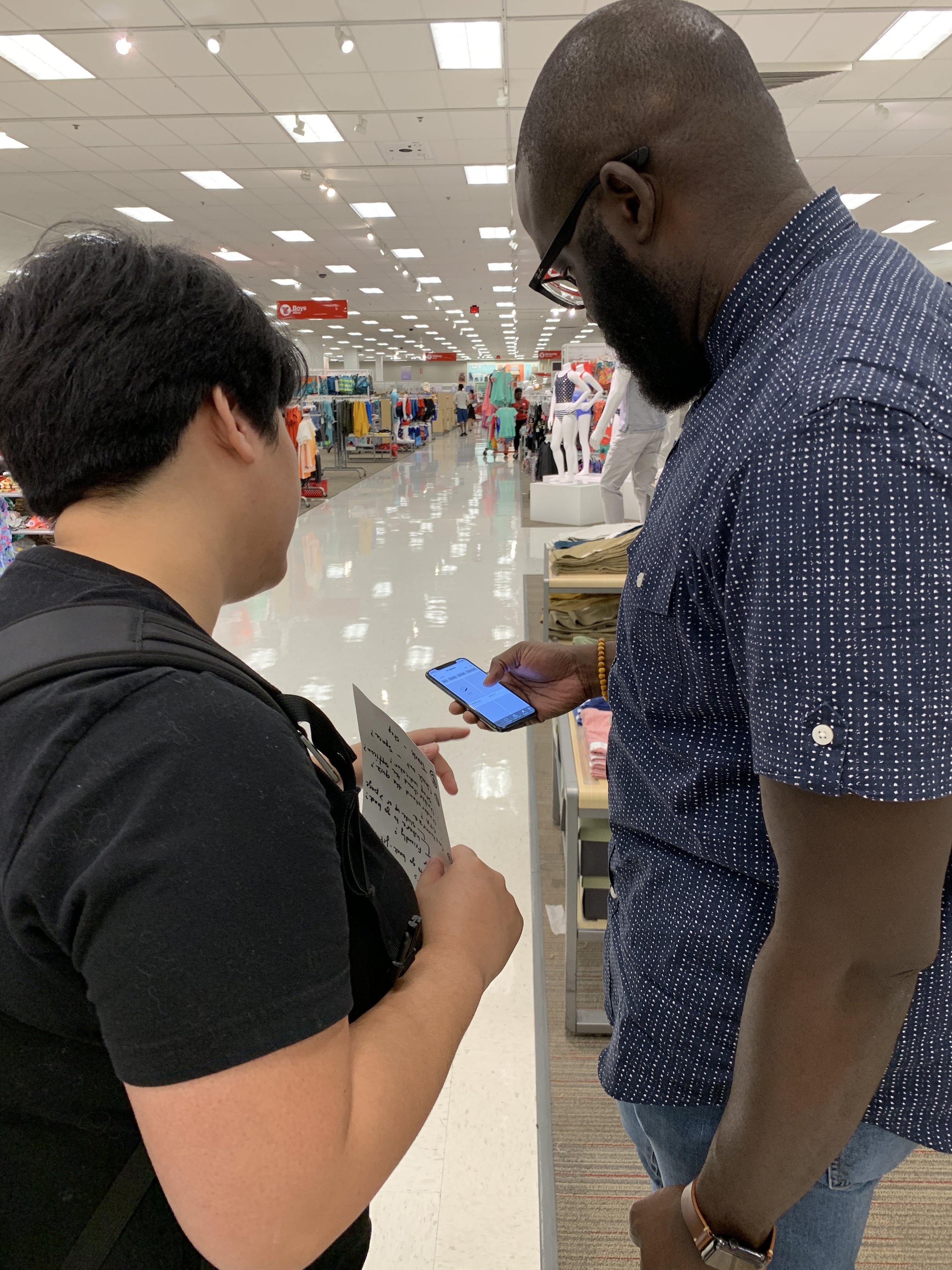
TEST
To keep in line with Lean UX, we set a round of testing on the 2 prototypes that we designed and we got out conduct 1:1 usability testing with real people at the Target in Midtown. We asked them to walk us through their thoughts and understanding of our product. We also conduct A/B testing on multiple features. With this feedback, we were able to consolidate our designs and turn it into one product.


Image Gallery of Testing


A/B TESTING
We conducted a/b testing Product Display page

A/b testing on Customize page

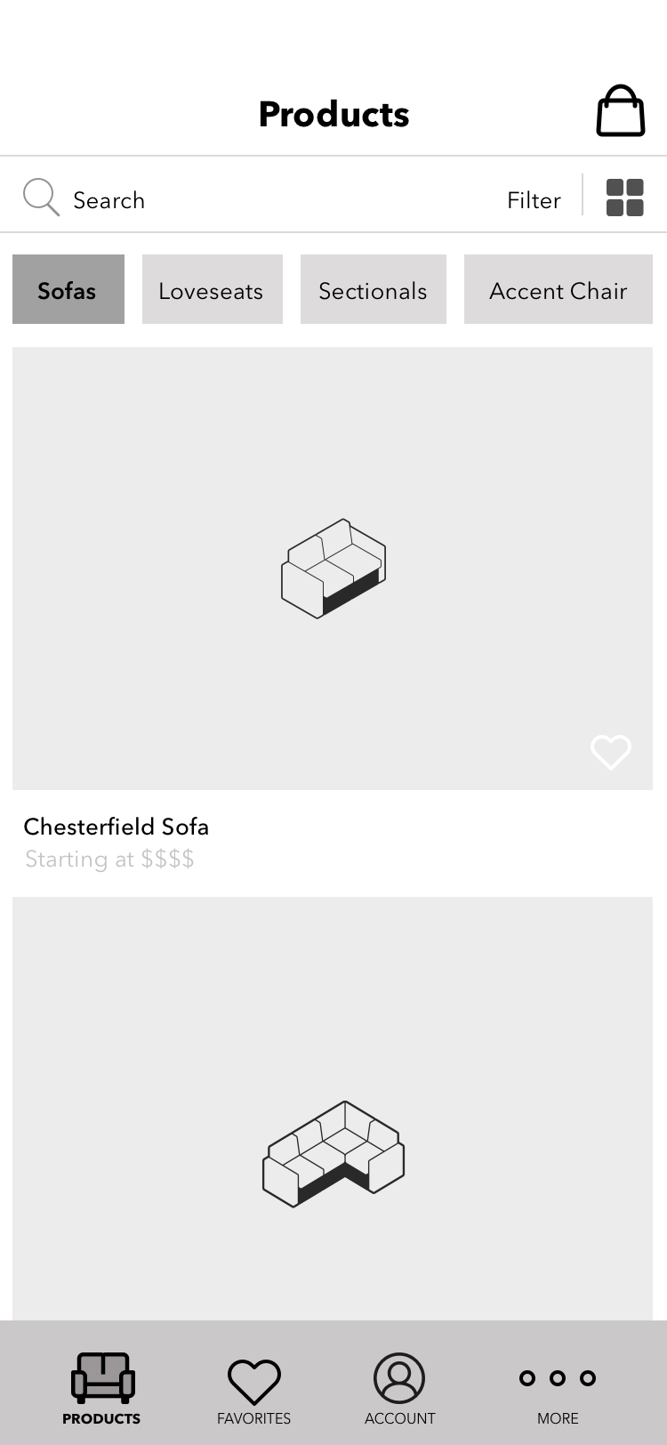
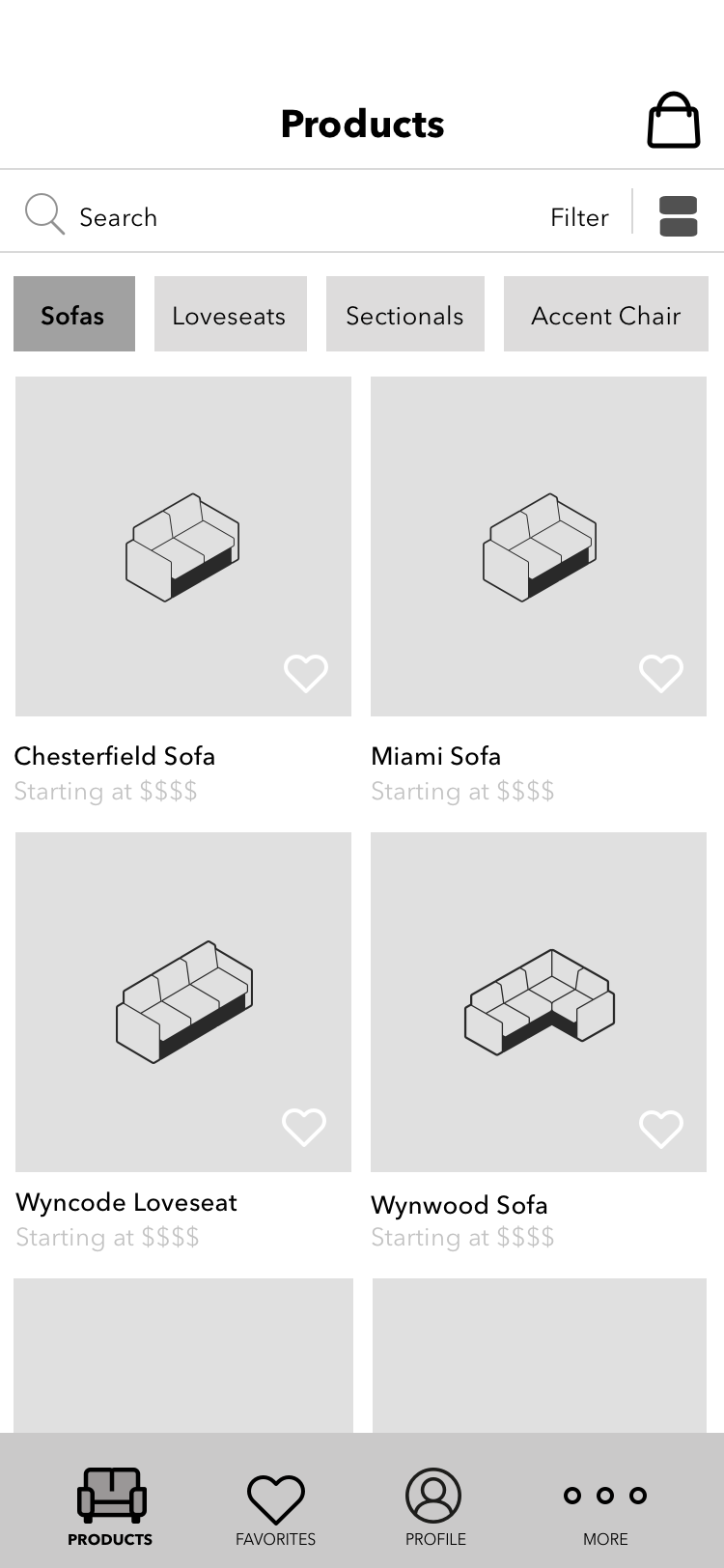
ITERATE
Product Display page iterations

Product Detail page iterations

Final Wireframes


HIGH FIDELITY MOCKUPS
I created a mood board to get inspired and from there we started designing our mockups on sketch app, to move up the fidelity from the design thinking approach of 'failing fast' .
FURNISH
DESIGN SYSTEM
The goal of a design system is to help the development teams achieve higher efficiency, consistency, and scalability when building digital products. It encompasses everything from typography and colors, to layouts and code rules.


ANNOTATIONS
Wireframe annotations are important because they give developers clear explanations to our apps functionality.

IXD
Micro-interactions are events which have one main task delight the user; to create a moment that is engaging, welcoming and, dare we say it — human.